
Typography Mastery: Banner design enhancement for maximum effectiveness
Posted by bannerNprint on Jun 05, 2024
Introduction
Within the dynamic landscape of advertising, every aspect of design is paramount. Specifically, typography can push banners to the forefront of audience consciousness or blur the audience's attention with unintended clutter. We recognize at bannerNprint that typography plays an integral role in creating banners that capture attention, arouse emotions, and incite action. Let's explore how to effectively utilize typography for banners.
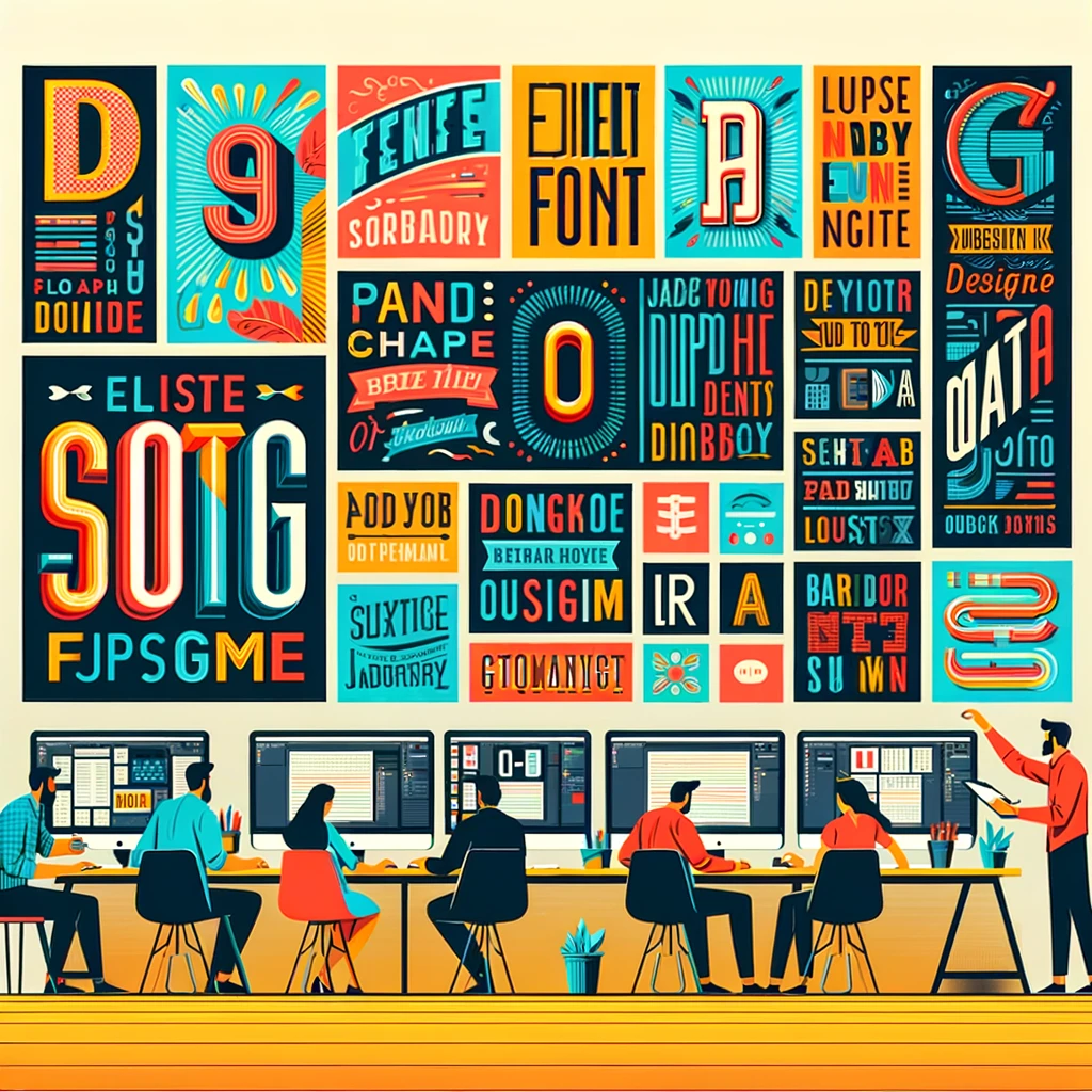
Essentials of Typography
Typography embodies a fusion of art and technology, making written language legible, intriguing, and visually arresting. It includes character selection, size, spacing, alignment, and more, with each element contributing essentially to the resonance of the message. The use of proper size, spacing, alignment, and other elements contributes significantly to the final quality of the design.
Standout Font
In banner designs, the size of text has a monumental impact. Maintaining a balance between readability and prominence ensures that your text commands attention without overshadowing the overall design narrative. Different text sizes can increase the contrast of your design, while balanced text sizes can enhance interest while maintaining readability. Font style selection is also crucial, as it communicates a specific design feel to customers. Whether you prefer the classic serif font for a sense of tradition or opt for the modern sans-serif font exuding sleek contemporaneity, our extensive font library meets your expressive needs.
Hierarchical Harmonization and Text Alignment
Establishing a consistent hierarchy within text promotes quicker understanding. Whether through headlines, subheadings, or body text, our design masters sculpt messages to ensure that pivotal information takes center stage. Additionally, precise alignment gives the design a sense of order and expertise. Whether you choose centered text, left-aligned text, or right-aligned text, all elements are carefully placed to exude visual poise and appeal. Improving readability is also essential. Optimal spacing between letters, words, and lines enhances readability and cognition. Our design experts finesse the spatial arrangement of text, ensuring easy readability and aesthetic cohesion.
Contrast Crafting
Contrast is a key component in making text stand out against the background of a banner. Skillful manipulation of color, size, and weight ensures that the text is clearly visible, signaling strong clarity to the viewer. The colors adorning the text hold profound psychological implications. Whether you opt for contrasting tones that are bold and attention-grabbing, or subtle and understated shades, we leverage the emotional power of colors to amplify the impact of the message. The use and contrast of colors may vary depending on the intended message you wish to convey.
Brand Harmony
Consistency breeds brand awareness and trust. Strengthening a brand's visual identity involves ensuring that typography seamlessly aligns with the brand ethos across marketing channels, ranging from font selection to color palette. Establishing a design system that embodies a brand's identity can lead to robust brand marketing.
Collaborative Creativity
Your vision is our inspiration. We work closely with you to leverage your insights and aspirations, tailoring typography solutions that authentically reflect your brand identity and deeply resonate with your audience.
![]()
Comprehensive Banner Printing Solutions
After you've crafted a successful design, considering printing quality is essential. Low print quality can diminish the final banner design's impact. Choose the best print service to initiate your journey toward effective banner design. bannerNprint offers cutting-edge printing technology and premium materials, ensuring your design is unparalleled, vibrant, and attention-grabbing wherever it's displayed. We continually analyze feedback and industry trends to advance our typography strategies, ensuring your banner remains at the forefront of efficiency, while also engaging in an ongoing process of improvement.
Conclusion
In the realm of banner design, typography isn't merely an incidental component; it emerges as the very essence of bringing your message to life. At bannerNprint, we stand as your partner, employing innovative design strategies and an unwavering commitment to excellence in typography that transcends mere words to convey emotions, evoke reactions, and forge connections. As we embark on our journey to effective banner design, typography entails more than just selecting fonts and arranging texts—it involves leveraging the entire spectrum of typographic elements to create an immersive experience that deeply resonates with the audience. Every decision, from font precision to color psychology, alignment assurance to responsive design ingenuity, shapes the trajectory of message conveyance and success.