
The Role of Color Psychology in Banner Design
Posted by bannerNprint on Jun 21, 2024
Introduction
Beyond visual elements, color is a powerful tool to influence emotions, behaviors, and perceptions. In order to create effective promotions, it is important to understand the role of color psychology in all designs, as well as banner designs. Color is one of the most fundamental elements that catch people's attention. In this post, we will learn how different colors can affect viewer response and how to leverage this knowledge to improve banner performance.
What is Color Psychology?
Color psychology is the study of how colors affect human behavior and emotions. A variety of colors can evoke different emotions and reactions, which can draw attention from marketing, send messages, and influence decision-making. By understanding the principles of color psychology, designers can make informed choices that enhance the effectiveness of their work, whether it be banners, websites, or physical spaces. Colors are not just aesthetic choices, but they are powerful tools to shape perceptions and actions in subtle but important ways.
The Influence of Various Colors
- Red: Known for its intensity and ability to focus attention, red is often associated with excitement, enthusiasm, and urgency. It is a popular choice for phone calls and sales banners for action. Red also increases heart rate and creates urgency, making it an effective color that induces viewers to respond quickly. If you want to catch consumers' attention with intensity, the use of red can be helpful.
- Blue: Ideal for corporate banners and brands looking to increase customer loyalty, often linked to trust, trust, and calm. Many financial institutions and healthcare providers use blue for their brands because it evokes a sense of security and reliability. Banner designs in blue can not only evoke reliability but also have a calming effect, reducing anxiety and creating a peaceful feeling. That's why it's perfect for businesses and brands that value a sense of peace.
- Yellow: This cheerful and lively color is good for creating optimism and happiness. It is effective for designs that aim to arouse excitement and encourage positivity. Yellow is also used for attention and often to highlight important information. However, it should be used less because too much yellow can cause visual fatigue. The way to emphasize the role of yellow while using less yellow is to use it with black or purple, which contrasts with yellow. You can improve the effect of yellow through strong contrast.
- Black: Black, which represents elegance, strength, and sophistication, is ideal for high-end brands and high-quality products. It is a timeless color that conveys authority and power and is often used in fashion and high-end retail. Black can add mystique and create dramatic effects that are suitable for bold and impressive designs. Also, the role of black in simple and modern designs is indispensable. It is a color that is indispensable for presenting neat and organized designs.
- White: Symbolizing purity, simplicity, and cleanliness, White is often used in minimalist design to create a modern, unkempt look. Its use of the most basic of white and black emphasizes minimalism and can present very modern, sophisticated designs. White can also be used to create a sense of space and openness, improving the overall readability and clarity of the design. As it relates to new beginnings and neutrality, it is versatile in various industries.
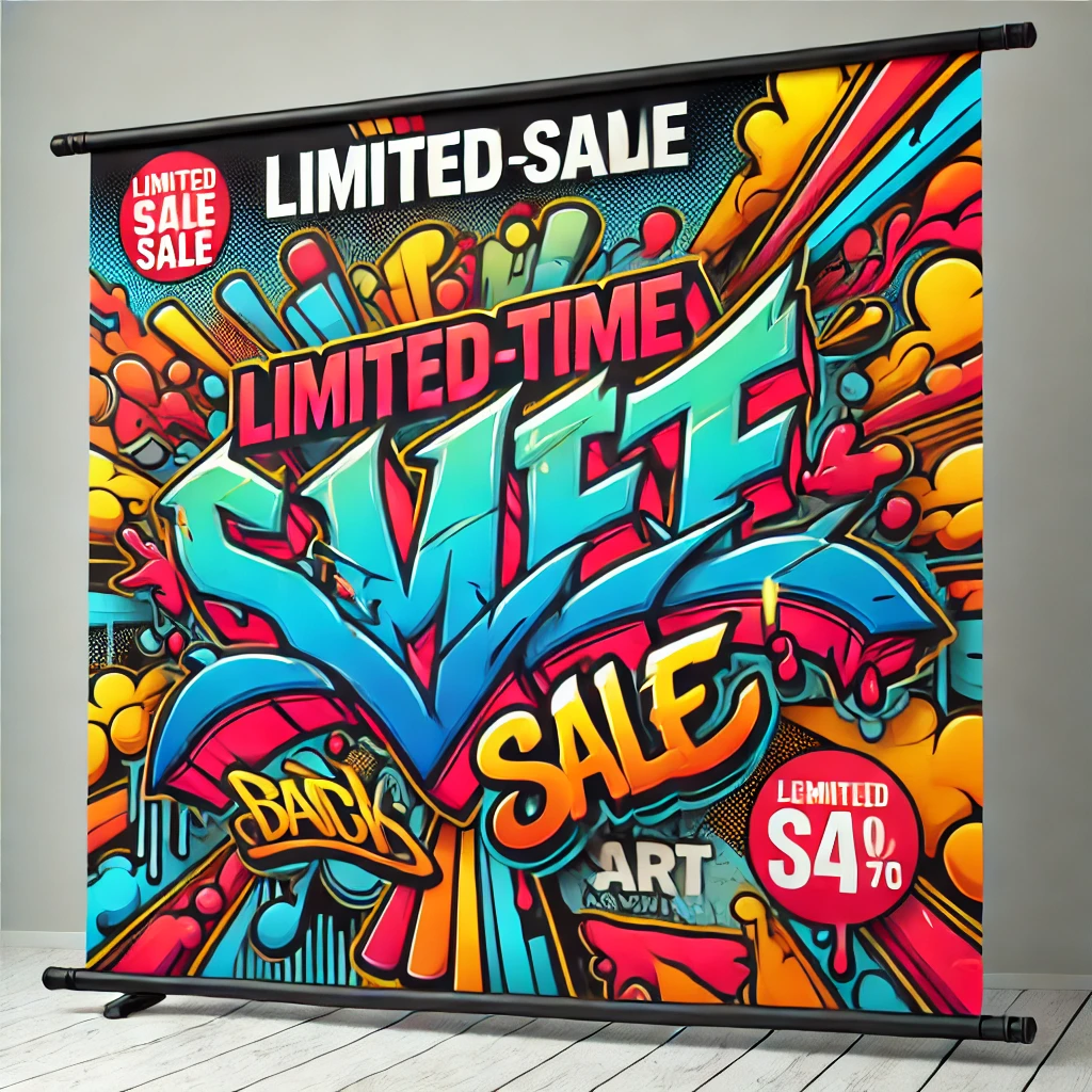
![]()
A Study on the Use of Color Psychology in Banner Design
- Find Out Your Audience: Different demographics may respond differently to colors. Research your target audience to understand their preferences and cultural perceptions of colors. Designs can vary depending on the target audience or the color that generations prefer. Understanding your audience is very helpful in improving your brand marketing.
- Defining Your Brand's Personality: The value and personality of your brand should lead you to choose a color. Representative colors that represent a brand should be considered carefully. It represents your brand and plays an important role in making people aware of its image. For example, playful brands can choose bright and bold colors such as yellow and orange, and more serious brands can choose calm colors such as blue or green.
- Balance and Contrast: Use contrasting colors to highlight important information and spark visual interest. The use of proper contrast plays an important role in highlighting design and information. However, make sure there is a balance to the design so that it is not overwhelming. Keep in mind that using excessive contrast can lead to eye strain.
Conclusion
Color psychology is an essential aspect of banner design that can significantly influence the effectiveness of your marketing efforts. By understanding how different colors affect emotions and behaviors, you can create banners that not only catch the eye but also resonate with your audience on a deeper level. Remember, the right color choices can transform a good banner into a great one, driving engagement and achieving your promotional goals.