How to Make Your Banner Stand Out in a Crowded Space
Posted by bannerNprint on Aug 22, 2024
Introduction
In today's fast-paced environment with shorter attention spans than ever, many people value making banners stand out in crowded spaces to promote their businesses. Your banner depends on your ability to be seen and remembered in a bustling retail store, whether it's a trade show or a festival. That's why it's important to consider a banner that stands out. Here's how to design a banner that not only catches your eye but also delivers your message effectively.
Choose the Right Colors
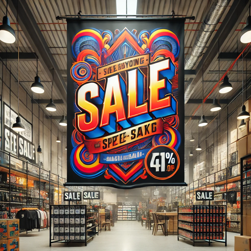
When designing standout banners in crowded spaces, colors are one of the most powerful tools at your disposal. The combination of black and yellow or high-contrast colors such as blue and white is excellent for readability. In addition, different colors evoke a connection with different emotions. For example, red is a color that often means excitement, urgency, or even passion. It is a great choice if you want to create urgency or draw immediate attention. On the other hand, blue is often associated with trust, calmness, and professionalism, making it ideal for industries where reliability is key. Make sure your color scheme matches your brand and the emotions you want to evoke.

Use Bold and Clear Fonts
Choosing a font can increase or damage the visibility of your banner. Choose bold, San Serif fonts that are easy to read from afar because they are clean and simple. Serif fonts can work on prints, but they can be difficult to read on large banners, especially in crowded or fast-moving environments. Also, the text size should be big and bold enough to be seen from afar. Key information, such as company name, slogan, or prompt action message, should be prominently displayed.
Keep Your Message Concise
In crowded spaces, people will not have time to read long paragraphs. The message should be clear and concise, focusing on the key points you want to deliver. A concise message is not only easy for the audience to absorb quickly but also ensures that the key points are delivered effectively. Use short phrases to deliver the message quickly. The message on the banner should also focus on the benefits the audience will receive, rather than the features of the product or service.

Incorporate High-Quality Images
Images can greatly enhance the appeal of banners. High-quality images not only attract attention but also help deliver messages quickly and effectively. Using the right images in a crowded space, where you only have seconds to grab someone's attention, will allow your banner to stand out and make a lasting impression. Select a high-resolution image that is relevant to your product or service. The images you select must be directly related to your product, service, or message. Images that match your brand and promotion will resonate more with your audience.
Optimal Placement is Key
The location where you place your banner is just as important as its design. Place it near the entrance to the venue, near a busy intersection, or at best visible eye level. Understanding foot traffic flow, visibility, and your surroundings can have a significant impact on your banner's effectiveness. If you're attending a trade show, use a pullable banner or hanging display to see if your banner can be seen from multiple angles.
Conclusion
What makes your banner stand out in a crowded space is strategic design and placement. By using the right colors, fonts, and images, and keeping the message concise and clear, you can create a banner that grabs attention and engages people. You can also strategically place your banner so that your design can effectively capture people's eyes. Remember, the goal is not just to be seen, but to be remembered.

